All of Government App Design

UX / Native / Strategy / Design system

The project

Designing a national digital platform built on trust, accessibility and long-term scale.

Govt.nz app

2025 - Ongoing

Android / iOS

All of Government App Design

Designing a national digital platform built on trust, accessibility and long-term scale.

Govt.nz app

2025 - Ongoing

Android / iOS

UX / Native / Strategy / Design system

The project

Product experience

A mobile platform designed around everyday government access, digital credentials, secure messaging, services and alerts.

The All of Government mobile app is a foundational piece of New Zealand's digital public service strategy. It isn't a single service or department, but a platform designed to support how people discover, access and engage with government — securely, accessibly and on their own terms.

This wasn't about shipping another app. It was about building trust at a national level, setting standards for accessibility and usability, and laying the groundwork for future services that would rely on a shared design and interaction model.

When government gets digital wrong, the cost isn't just frustration — it's exclusion.

The challenge

Designing for complexity without showing the complexity.

This was not a space for experimentation without consequence. Every decision needed to be defensible, inclusive and scalable.

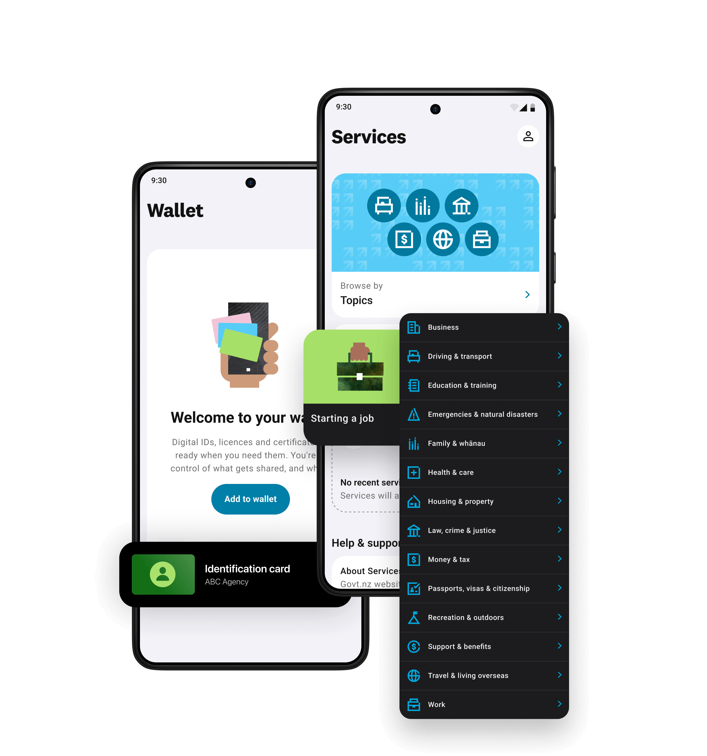
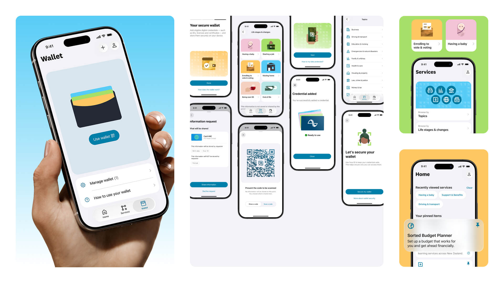
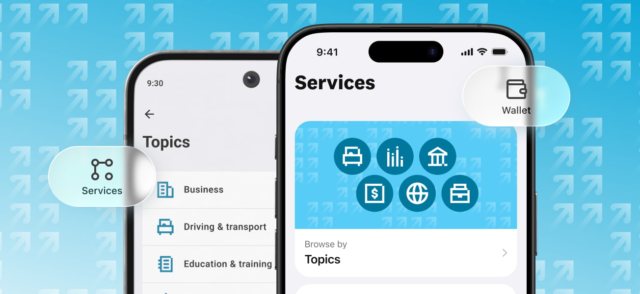
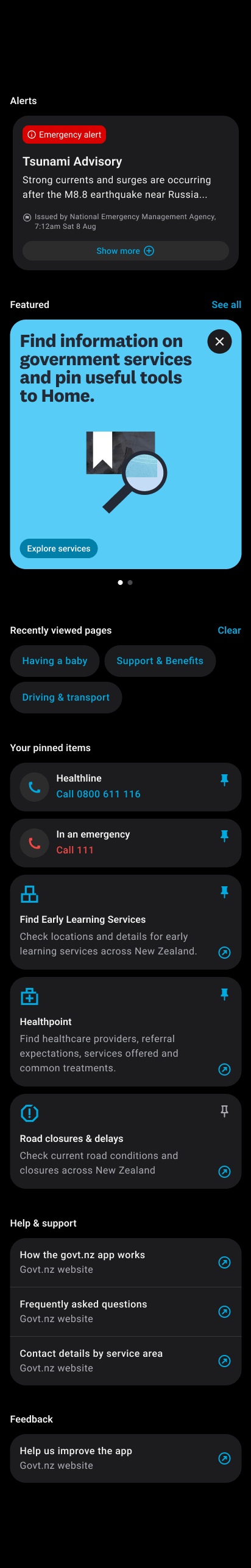
The app needed to support a national audience with vastly different needs, levels of confidence, devices and access requirements — while still feeling clear, calm and practical.

A national audience with different needs, capabilities and access constraints.

High expectations around accessibility, trust and clarity.

Multiple departments, stakeholders and delivery partners.

Long-term platform thinking, not feature-led delivery.

The need to balance innovation with caution, policy and public accountability.

Govt.nz app product experience shown across multiple app screens

My role

Design leadership at platform scale.

As UX Director at Dave Clark, I led the experience direction and system thinking for the app, working closely with DIA, product leadership, technical teams, researchers and delivery partners.

My role was to help turn a large, complex public-service ambition into a coherent product experience: shaping the design principles, core journeys, interaction patterns, design-system foundations and accessibility approach.

The work required more than screen design. It was about making complexity visible, creating alignment across teams and translating policy, technology and human need into product decisions people could trust.

Set the experience strategy and design principles.

Led the design-system and pattern thinking underpinning the platform.

Shaped core journeys and interaction models.

Embedded accessibility and usability standards from the start.

Bridged policy, technology, delivery and user needs.

Govt.nz app product experience shown across multiple app screens

Design system

A system that could grow beyond MVP.

A core part of the work was establishing a design system and interaction model that could scale across future services, be reused by multiple teams and maintain consistency without stifling evolution.

The system focused on clear navigation and content hierarchy, predictable interaction patterns, strong defaults for accessibility and readability, and governance that enabled reuse without slowing delivery.

This wasn't just about UI consistency. It was about creating confidence for both users and delivery teams.

Scale across future services.

Reuse by multiple teams.

Consistency without blocking evolution.

Accessibility and readability by default.

Clear navigation, hierarchy and interaction patterns.

Govt.nz app product experience shown across multiple app screens

Principles

Designing for trust, not just usability.

Rather than focusing on individual features, we approached the app as a platform — thinking in terms of patterns, behaviours and repeatable interactions that could support future services without fragmentation.

01

Clarity over cleverness

02

Accessibility as a baseline, not a feature

03

Consistency builds confidence

04

Design for the long term, not the launch

Collaboration

Design became a tool for alignment, not just execution.

The project required close collaboration across government stakeholders, policy teams, technical and delivery partners, accessibility specialists, researchers and testing partners.

A key part of my role was helping teams align around shared goals, making complexity visible and ensuring design decisions were grounded in both user insight and organisational reality.

Outcomes

A trusted foundation for what comes next.

The app launched as a clear, accessible and trusted entry point into government services, underpinned by a design system built for growth.

Established a shared experience baseline for future services.

Raised the bar for accessibility and usability in government digital products.

Created a platform teams could build on with confidence.